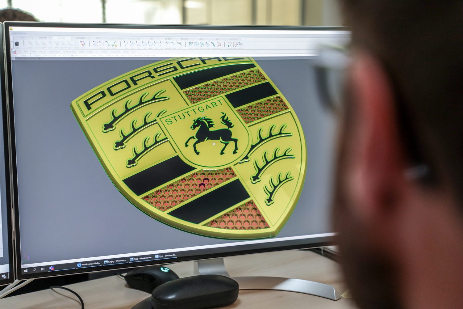
We know this is shocking news, and you might want to sit down for a moment. Take a deep breath, brace yourself and then we'll tell you that... Porsche is changing its badge!
We know, we know, this is shocking news. Look at it! It's totally different and weird and it's strange and... actually hang on, it's pretty much the same, isn't it?
Red, gold and black
Come on, Porsche ( the company that only ever carefully evolves its cars) was never going to make major changes to its famed badge, was it? It's still the same shield shape, with the coat of arms of the city of Stuttgart, Porsche's hometown, and it's still finished in red, gold and black.
There are some subtle differences though. The shape of the shield is slightly different - it's now a little wider at the top and a little more pointed at the bottom - while the gold background colour is a little deeper, richer and more subtle.
The 'Porsche' lettering at the top is subtly altered too, while the red bars now get a 3D-effect honeycomb look, which is to "symbolise lightweight construction and efficiency." The antlers - yes, those black bits are antlers - are now a little more 3D and have a 'shimmering contour' effect.
Same horse as Ferrari?
At the centre of the badge is the famed rearing black horse (yes, there are Ferrari links here - the same rearing horse badge was used by WW1 Italian fighter ace Francesco Baracca, who apparently used it in honour of a German pilot he himself had shot down. Baracca later 'gifted' the horse logo to Ferrari to use on its racing cars) has also been updated. Porsche says that it is now shown "in the moment it rises up before starting to run. It confidently embodies determination, dynamism and the will to win."
Porsche has used this badge since 1952, when it was first suggested by the company's US importer. Since then, the crest has been slightly and subtly updated in 1954, 1963, 1973, 1994 and 2008. You can still buy the correct age-appropriate badge for your older Porsche from the company's parts department and of course - famously - the GT models get a sticker badge, rather than a metal-and-enamel one, to save weight.
75th anniversary
"The 75 years of Porsche sports cars' anniversary was the occasion for us to fundamentally rework this trademark," says Michael Mauer, Vice President Style at Porsche. "With its much cleaner and more state-of-the-art execution, the new crest communicates the character of Porsche. We have reinterpreted historical characteristics and combined them with innovative design elements such as a honeycomb structure and brushed metal. The result is an aesthetically ambitious arc that bridges the history and the future of the brand."
Most of the work on redesigning the badge was done by Joachim Paetzel, Specialist for Colour and Trim at Style Porsche. "The time factor is very important in a maturing process such as this," Paetzel describes the iterative procedure of designing the crest. "A new trademark is not designed 'off the cuff' within a few days. You have to go back to it again and again, sometimes at longer intervals. The second or third look can reveal to you things that you want to optimise, until it finally achieves a harmonious, natural effect. Only then can you say with satisfaction: 'This is exactly how it has to be!'"


